Apple need a dark mode
This is part 2 in a series about why we need dark modes to be an inclusive design consideration.
- Molly Watt
- Apple need a dark mode
- The dark web rises
Last year, I met Molly Watt.
Molly has Usher Syndrome; a condition that has left her deaf with 5–degree vision in one eye.
Laptop glare in a dark setting by Jay Wennington on Unsplash
Molly is still a visual person. One of the problems Molly has when interacting with digital services is high contrast, specifically white backgrounds with black text.
I am a designer at the UK government. GOV.UK pride themselves on championing the needs of users, designing inclusively and building digital services that are accessible to everyone. Yet, the website is practically all white background with black text. It creates too much glare and makes it impossible for Molly to focus. It’s unusable.
The challenge
How might we allow people to change the text and background colour to suit their needs, without effecting images, video, meaning or brand?
Starting with one thing
I started with the assumption that a style switcher would solve this problem—by designing a toggle that would let users switch between a light and dark mode when needed.
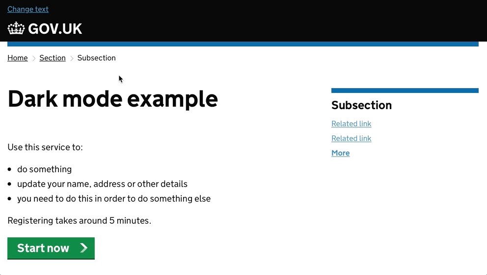
GOV.UK prototype to test an idea
Reading the content in dark mode would be bearable for Molly, and might benefit others too—enhancing the experience for a user with a headache, or someone browsing in a poorly lit room. Designing for the few, makes things better for the many.
Thinking of the many
I then thought about people who have different access needs to Molly. People whose needs could be met with a similar solution. Molly’s own website has a classic accessibility toolbar, allowing people to switch between a number of different colour combinations and even change the size of the text.
Designer Craig Abbott recently implemented a great version of this on his own website that includes the ability for dyslexic users to change the typeface to one that provides increased readability for them.
There used to be a lot of websites during the 00s that had these accessibility toolbars, but it’s something that seems to have fallen out of fashion. Surely, if we build one of these for GOV.UK, that will solve the problem.
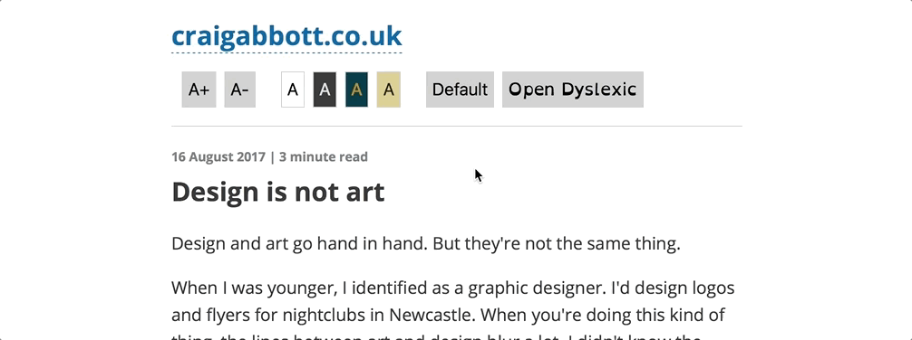
The toolbar on Craig's website is great, until you leave
Well—while the outstanding efforts to make these websites more accessible should be celebrated, neither really solves the problem. These solutions exist in a vacuum. As soon as the user navigates to a different website that doesn’t have one of these toolbars, the customisation is lost and the experience is broken. Even if the next website did have one of these toolbars—so the option was available to make it more accessible—it wouldn’t know the settings from the previous website, so the user would always be starting from scratch. This isn’t inclusive. It’s a hack, and maybe that’s OK for now—but. We need something better.
Something slightly better
People need a way to change the text and background colours consistently, across all websites to better suit their needs. The BBC have guides on how to do this on your computer, but I wouldn’t say the steps in these guides are easy for everyone to follow and they’re still a hack.
Also—at the time of writing, people use their mobile device more than they do their desktop computer, so those guides won’t help more than half the time.
We need to be providing inclusive design solutions that meet the demand and expectations of the digital era we live it today.
Apple (and others) need to solve this problem
Molly is 22 and like most people her age, uses her iPhone and iPad to access the internet and stay connected.
Apple provide in-built accessibility features to help people with access needs use their technology which is brilliant—but. One thing I don’t think they do very well, is shout about it enough. I would love to see Tim Cook talk passionately about how Apple are making things easier for people with access needs. Unfortunately, this year I think we’ll instead see overly-excited cheers at new emojis.

Some of the new emoji coming to iOS, macOS and watchOS later this year
Molly has talked and written about how Apple products have made her feel less excluded from society, which is great. But, one thing Apple haven’t yet implemented is the option to switch to a true Dark Mode, that would make changes across the Operating System (OS), native Apple apps, third-party developer apps and web browsing.
Apple (and others) need to be making inclusive design considerations for in-built accessibility features like a Dark Mode that just works, without the need for continuous tinkering or hacks.
Everyone should be able to customise their settings for a consistent accessible experience across all their devices, so they can interact with and consume content without barriers.
Apple might be getting smarter
On iPhone and iPad there has been the option to Invert Colours. You can map this as an accessibility shortcut, so when you triple-click the Home Button, the colours will invert (white to black, black to white, etc).
The problem is that this inverts everything, which makes images unusable, brands unrecognisable, and can create confusion in interactions that previously had clear context. Inverting everything also causes a previously dark interface to become glaringly bright, which is not a solution to the problem.
There is a new feature coming called Smart Invert, which can be found in the public beta of iOS11. Unlike Classic Invert (as it is now called), this does not invert everything and appears to be a baby-step towards to a true Dark Mode. Previously bright interfaces like Mail and iMessage, become dark. Interfaces that were already dark like Clock and Calculator, do not change. Likewise, the Home Screen doesn’t change much and your photos stay the way they were supposed to be.
I am unable to take any screenshots, as weirdly the images end up re-inverting themselves which I’m hoping is a bug. 9to5mac have some good images of Smart Invert in action.
Unfortunately, third-party developer apps still mimic the Classic Invert, so everything, including images are changed. This means apps like Instagram are rendered unusable and Twitter—which already has it’s own Dark Mode option—is flipped for the worse. Browsing the web is just as difficult as it was before.
I hope that this is something that app developers will eventually be able to take advantage of, by specifying which parts of the interface should and should not change when using Smart Invert.
However, this would still need developers to make the decision to implement this, and there are no guarantees they will. Especially depending on the size of the app, this may end up being perceived as too much work to bother. Likewise, I have no idea how this would work with browsing websites, but if it required every website developer to do something, it would never happen.
So, this new feature should really be called Slightly Smarter Invert But Not Smart Enough.
So, what is the solution?
I don’t know.
Right now, we have a series of different hacks.
Some of these hacks put the responsibility on designers and developers to implement one-off solutions that will only work on their app, or website.
Others require the user to know a decent amount about their technology in the first place, to know how to successfully configure their device when it’s an option.
And then there are the things that you need to know even exist, before you can start taking advantage of them. Accessibility features just aren’t shouted about as much as they should be.
GOV.UK could, and probably should do more research into an accessibility toolbar, because the information and services on that website are meant for everyone.
Beyond that, we need companies like Apple, Google, Windows and others that design and build OSs, devices and browsers to consider the needs of users like Molly and solve the problem once, to solve it everywhere.