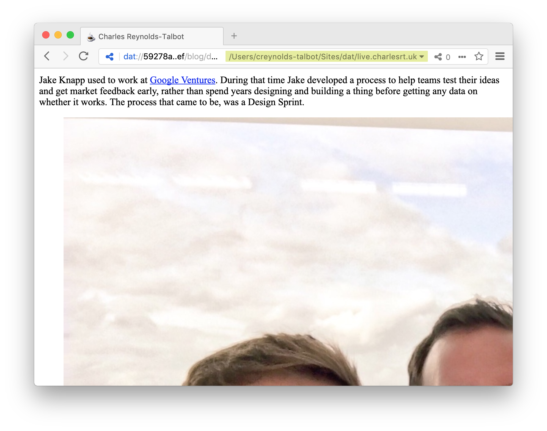
This is my baseline
I’m throwing caution to the wind and forgetting about global CSS resets like normalize.css and Eric Meyer’s reset.css because:
I’m not convinced I need to make use of everything in these resets (I don’t even know what
<kbd>is 🤷♂️) or support all the browsers they attempt to. Does it matter if someone visits my tiny website in IE8 and something doesn’t look perfect? I’ll give you a hint: no.They’re pretty bloated because they’re trying to fix everything for everyone. I don’t need 341 lines of code before I’ve even written a line of my own.
There’s no point in resetting something that I’m just going to override later. I should declare the values I want to set and forget the reset.
This is my master plan: to lay only the CSS foundation I need to—when I need to—and layer on my opinionated component styling to serve as my own default for building websites: my baseline.
My Baseline
This post is out of date relative to the CSS I’m currently using on this site. I will update this and create a repo as soon as possible.
:root {
  font-family: system-ui,
               -apple-system,
               BlinkMacSystemFont,
               "Segoe UI",
               "Roboto",
               "Oxygen",
               "Ubuntu",
               "Cantarell",
               "Fira Sans",
               "Droid Sans",
               "Helvetica Neue",
               "Apple Color Emoji",
               "Segoe UI Emoji",
               "Segoe UI Symbol",
               sans-serif;
  font-size: 16px;
  line-height: 1.5;
  overflow-wrap: break-word;
  -ms-text-size-adjust: 100%;
  -webkit-text-size-adjust: 100%;
  -webkit-font-smoothing: antialiased;
  -moz-osx-font-smoothing: grayscale;
  -webkit-tap-highlight-color: transparent;
  background: black;
  color: silver;
}
body,
blockquote,
figure {
  margin: 0;
}
main {
  display: block;
  max-width: 512px;
  margin: 0 auto;
  padding: 0 1em;
}
h1,
h2,
h3,
h4,
h5,
h6 {
  font-weight: bold;
  font-weight: 800;
  line-height: 1;
}
h1 {
  font-size: 4rem;
  margin-top: 4rem;
  margin-bottom: 4rem;
}
h2 {
  font-size: 2rem;
  margin-top: 4rem;
  margin-bottom: 2rem;
}
h3 {
  font-size: 1.5rem;
  margin-top: 2rem;
  margin-bottom: 1rem;
}
h4 {
  font-size: 1rem;
  margin-top: 1rem;
  margin-bottom: 0.5rem;
}
p {
  margin-top: 1rem;
  margin-bottom: 1rem;
}
a {
  color: aqua;
}
a:link,
a:visited {
  color: aqua;
}
a:hover,
a:active,
a:focus {
  color: yellow;
}
img {
  max-width: 100%;
  height: auto;
}
figcaption {
  color: gray;
}
pre,
code {
  background: navy;
  color: gray;
  font-size: .875rem;
  letter-spacing: .05rem;
  padding: .125rem .25rem;
}
Let’s break it down.
Images
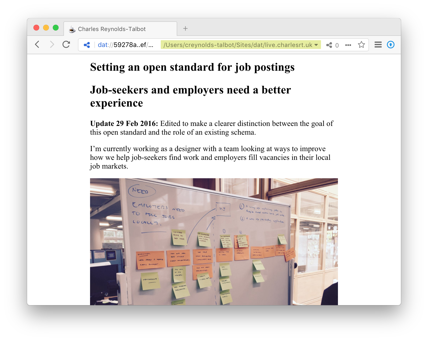
One of the immediately obvious problems viewing my website using only native browser styling is how images are rendered: huge. Well, full size to be fair, but in all circumstances that full size is much bigger than your average viewport. On mobile it’s just ridiculous so let’s add some CSS to take care of this.
img {
  max-width: 100%;
  height: auto;
}
By using max-width: 100%; images will confine themselves to the <figure> element and stop overflowing the viewport. Aspect ratios are kept in check with height: auto;
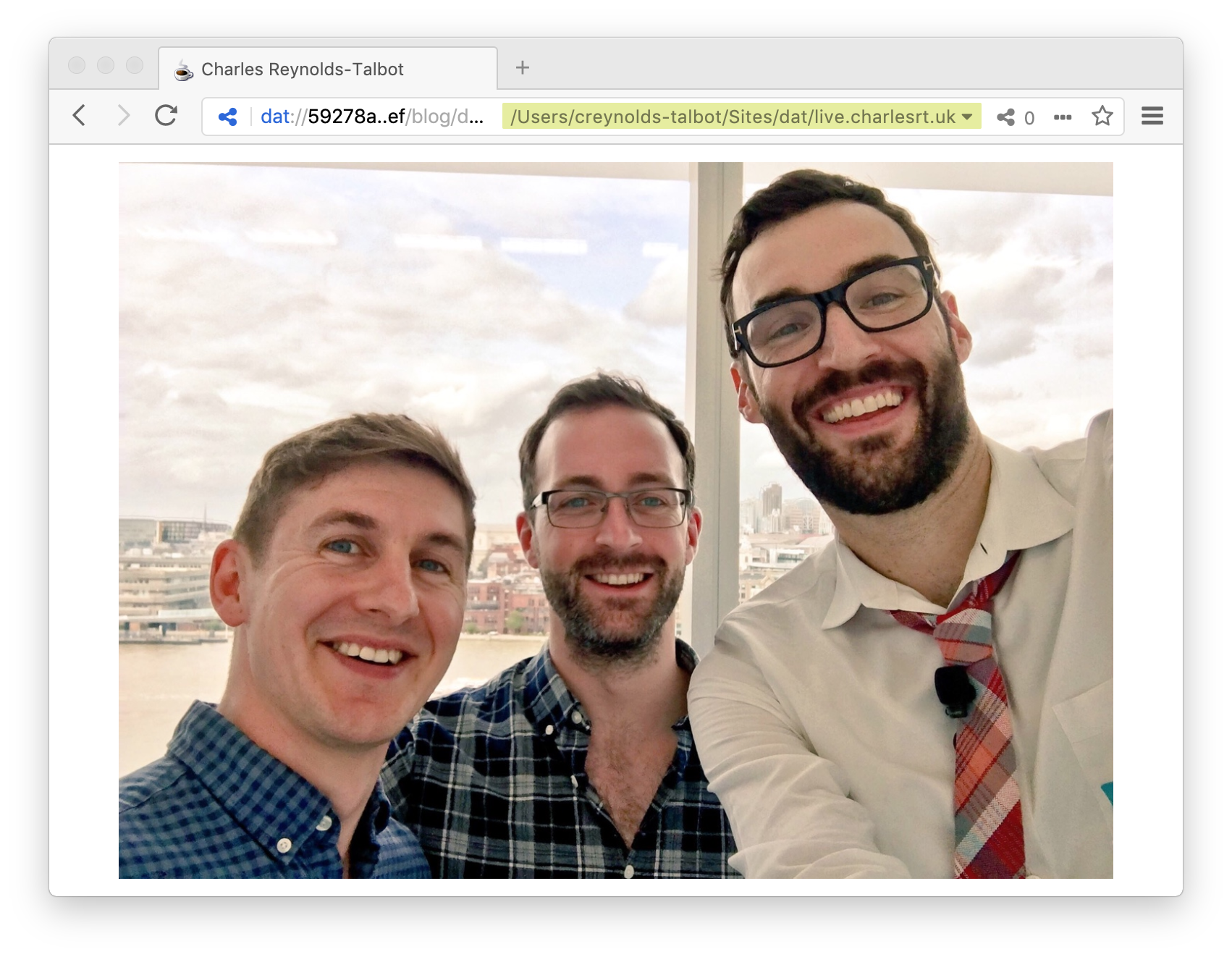
Before
Clearly there's a problem with lack of default img styling.
After
Much better. Now you can see me, Chris and the legendary Jake Knapp.
Margins
Now my images are in control it’s clear there are some unwanted margins present. It might be necessary to play with the content rhythm later but that’s a conscious design decision that’ll need be made. In the meantime everything should be aligned consistently.
body, blockquote, figure {
  margin: 0;
}
Before
Browser defaults have made design decisions for me.
After
Consistent alignment but too close to the edge.
All content is now aligned to the very edge of the viewport and is only constrained by the width of the users browser. This isn’t ideal and can make for some lengthy reading lines.
I’m going to solve this problem by wrapping the dominant content of the page in a <main> element with a maximum width of 512px. This keeps line lengths appropriate for better readability. The content block is centred with auto margins left and right, while a little padding keeps content off the edges of smaller viewports.
main {
  display: block;
  max-width: 512px;
  margin: 0 auto;
  padding: 0 1em;
}
Better
If only, browsers did this by default.
Typography
I’ve already started to address some typographic defaults by setting a maximum width on the content to maintain a readable line length. Time to get serious.
System fonts are the new black. All browsers should use system fonts by default. This means my website will use the same core font as the device you are using. Fe, San Fransisco on iOS or Roboto on Android.
Let’s go through them:
system-uiis future proofing this concept and the latest versions of Safari and Chrome already use this so eventually we don’t have to maintain a huge stack.-apple-system, BlinkMacSystemFontis for Apple device users and dynamically uses the correct font depending on size between San Fransisco and San Fransisco Display."Segoe UI", "Roboto", "Oxygen", "Ubuntu", "Cantarell", "Fira Sans", "Droid Sans"take care of every other operating system I could find."Helvetica Neue"is for legacy Apple devices."Apple Color Emoji", "Segoe UI Emoji", "Segoe UI Symbol"force the use of the devices emoji fonts which are often more up-to-date than the browsers.sans-serifif all else fails.
Not all browsers share the same font-size and line-height so setting defaults for this ensures consistency and provides a base to build off. 16px and 1.5 are a great default for better reading.
On occasion, I display full URLs as part of links in content. If lengthy, these can overflow the <main> container and cause some unwanted side-scrolling. overflow-wrap: break-word; stops this from happening.
The text-size-adjust declarations stop mobile browsers from scaling your text causing rendering issues. Why they do this: I don’t know.
It’s good to use font-smoothing to make text lighter and easier to scan. This also helps prevents occasional flicker on load or scroll and takes some load off browser performance too.
Finally tap-highlight-color hides the flicker that happens when you tap an element on mobile devices. I’ll need to ensure I have suitable hover states later so users get feedback to their interaction.
:root {
  font-family: system-ui,
               -apple-system,
               BlinkMacSystemFont,
               "Segoe UI",
               "Roboto",
               "Oxygen",
               "Ubuntu",
               "Cantarell",
               "Fira Sans",
               "Droid Sans",
               "Helvetica Neue",
               "Apple Color Emoji",
               "Segoe UI Emoji",
               "Segoe UI Symbol",
               sans-serif;
  font-size: 16px;
  line-height: 1.5;
  overflow-wrap: break-word;
  -ms-text-size-adjust: 100%;
  -webkit-text-size-adjust: 100%;
  -webkit-font-smoothing: antialiased;
  -moz-osx-font-smoothing: grayscale;
  -webkit-tap-highlight-color: transparent;
}
Before
This looks a little unpleasant and the browser doesn't understand the latest unicode [emoji] characters.
![This looks a little unpleasant and the browser doesn't understand the latest unicode [emoji] characters.](typography-before.png)
After
A much better default.
Colour
Colour choice can be highly opinionated—such as my desire for ‘dark by default’ user interfaces—but there’s sound reason behind it you can read more about in Apple and others need a dark mode for people like Molly Watt.
Where possible, baseline colours should aim for strong Level AAA contrast ratios. Whilst Level AA is the minimum, there is rarely a need to go so low and higher contrast can be better for everyone. However, go too high and you could be introducing unwanted glare.
Be mindful of the colours you choose. This is where colour choice is less about opinion and more about responsible selection and use.
Another thing to be mindful of is links. Links are the cornerstone of the internet so it’s surprising they’re still not handled well by default.
Hover states should always be honoured regardless of whether the link has been previously visited or not. On that subject, visited links don’t need their own distinguished style; they should be styled the same as regular links. Don’t forget about focus states for keyboard users.
:root {
  background: black;
  color: silver;
}
a {
  color: aqua;
}
a:link,
a:visited {
  color: aqua;
}
a:hover,
a:active,
a:focus {
  color: yellow;
}
figcaption {
  color: gray;
}
pre,
code {
  background: navy;
  color: gray;
}
After
Dark by default; Level AAA colour contrast.
Font size and margins
A lot of CSS resets aim to do just that: reset. They take away any browser styling and make everything the same so you can declare the values you want after—but. You can do this anyway. There is no need to reset a value. Just declare your own from the outset.
I enjoy working with multiples of 8 and only tend to deviate for certain elements. You can achieve good progressive size and spacing this way: 8px 16px 32px 64px 128px.
I use rem as it’s easier to work from my root em measurement which is 16px.
h1,
h2,
h3,
h4,
h5,
h6 {
  font-weight: bold;
  font-weight: 800;
  line-height: 1;
}
h1 {
  font-size: 4rem;
  margin-top: 4rem;
  margin-bottom: 4rem;
}
h2 {
  font-size: 2rem;
  margin-top: 4rem;
  margin-bottom: 2rem;
}
h3 {
  font-size: 1.5rem;
  margin-top: 2rem;
  margin-bottom: 1rem;
}
h4 {
  font-size: 1rem;
  margin-top: 1rem;
  margin-bottom: 0.5rem;
}
p {
  margin-top: 1rem;
  margin-bottom: 1rem;
}
pre,
code {
  font-size: .875rem;
  letter-spacing: .05rem;
  padding: .125rem .25rem;
}
8 16 32 64 128.